Number chart printables are a staple for classrooms, homeschool setups, and math‑focused craft projects, yet even seasoned creators can stumble over design choices that reduce usability or increase production costs. By pinpointing the typical oversights—from font selection to file formatting—experienced hobbyists can streamline their workflow, improve learner engagement, and cut the need for costly re‑prints.
What layout errors most often sabotage a number chart?
Even a well‑intentioned design can become cluttered if the grid spacing is inconsistent or if numbers are misaligned. A common slip is using uneven cell dimensions, which forces the eye to hunt for the next number rather than read sequentially. The fix is to lock the grid to a fixed column‑row ratio (e.g., 1‑inch squares) and apply a consistent margin on all sides. Aligning numbers to the center of each cell, both horizontally and vertically, preserves visual rhythm and speeds up scanning for students.
Which fonts and colors should I avoid for readability?
Choosing a decorative typeface may look appealing, but it often sacrifices legibility—especially when the chart is printed on low‑resolution home printers. Sans‑serif fonts such as Arial, Helvetica, or the open‑source Montserrat retain crisp edges at 300 dpi and below. Likewise, high‑contrast color schemes (black on white, dark blue on light gray) are safer than low‑contrast pairs like pastel yellow on white, which can fade into the background. Avoid using more than two colors in the same chart; a single accent color for highlighted multiples is sufficient.
How can I prevent file‑format headaches?
Many hobbyists export their charts as JPEGs to keep file sizes small, only to discover that compression artifacts blur the numbers. PDF remains the gold standard for printable assets because it preserves vector data, ensures exact dimensions, and embeds fonts. If a raster image is unavoidable, export as PNG with a transparent background and a resolution of at least 300 dpi. This approach eliminates unwanted pixelation and keeps the chart crisp on both inkjet and laser printers.
What visual cues should I avoid that could confuse learners?

Icons and decorative borders are tempting, yet they compete with the primary function of the chart: quick number identification. Overloading a cell with a small icon or a patterned background distracts the reader and can cause misreading of adjacent digits. Reserve visual markers for whole‑row or whole‑column highlights (e.g., shading every fifth row) rather than individual cells. This keeps the chart clean while still offering useful patterns for multiplication or skip‑counting exercises.
How do I test a printable before sharing it with others?
Before uploading a final version to a teaching resource platform, print a test sheet on the intended paper type. Check for:
- Clear number edges at the chosen scale.
- Consistent cell alignment across the entire sheet.
- Accurate color reproduction (especially if using a highlight color).
- Absence of unintended cropping or margin shifts.
If any of these points fail, return to the design file and adjust the grid settings or export parameters. A single test run typically saves multiple re‑prints and preserves the creator’s reputation for quality resources.
What steps ensure long‑term usability of my number chart?
Beyond the initial print, think about how the chart will be stored and reused. Laminating the final product protects against spills and repeated handling, extending its lifespan in a busy classroom. For digital distribution, bundle the PDF with a short usage guide that outlines optimal print settings (e.g., "Print at 100 % scale, portrait orientation") to prevent end‑users from unintentionally scaling the chart and breaking the grid.
By systematically avoiding these pitfalls—irregular layouts, illegible fonts, unsuitable file formats, distracting visuals, and insufficient testing—experienced hobbyists can produce number chart printables that are both aesthetically pleasing and pedagogically effective. The result is a reliable teaching tool that supports numeracy development without the frustration of re‑printing or redesigning.
Top 7 Mistakes To Avoid When Filing A Travel Insurance Claim

Top 7 Mistakes to Avoid When Filing a Travel Insurance Claim
Avoid In English: Usage, Structure & Examples
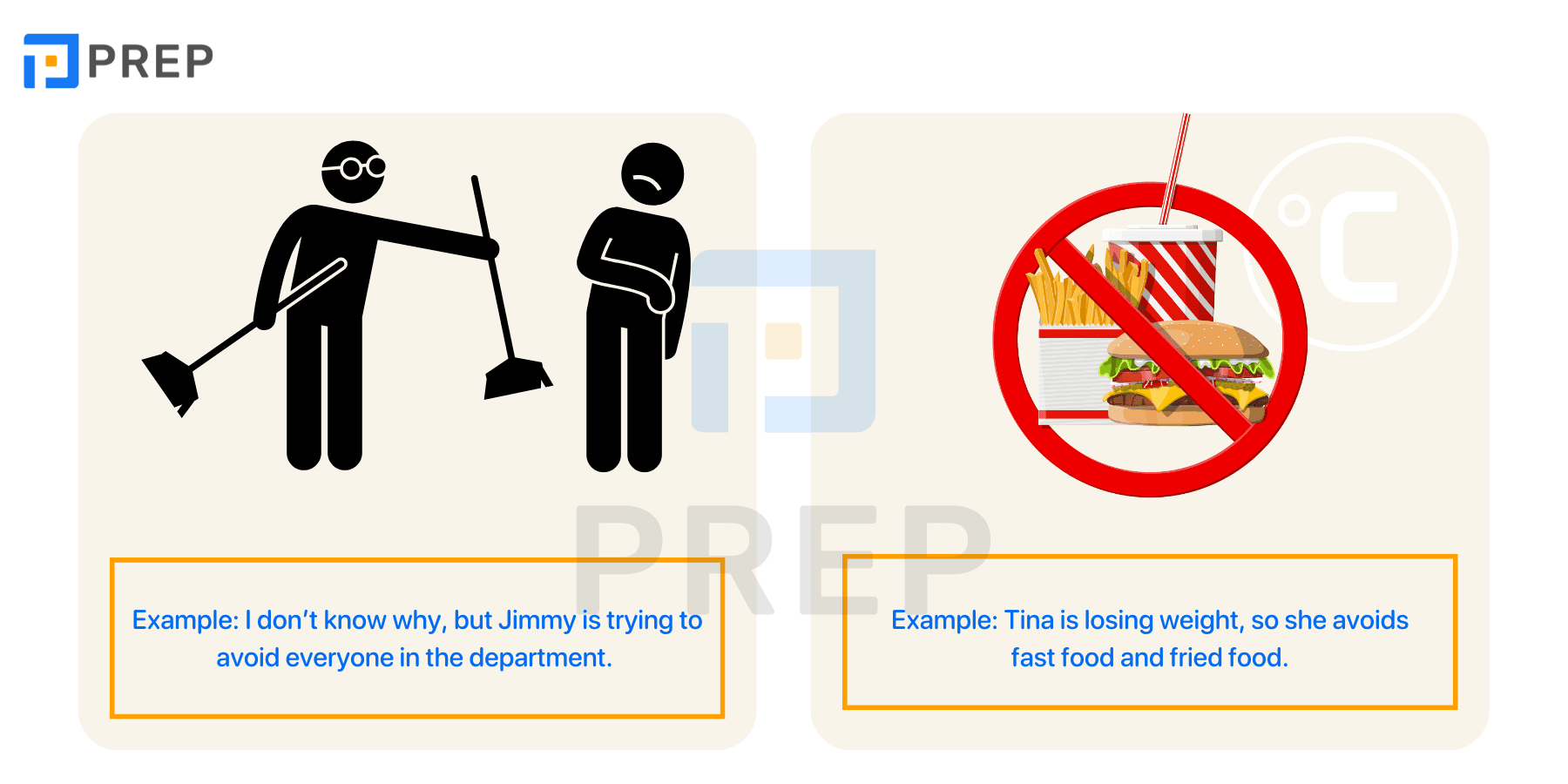
Avoid in English: Usage, Structure & Examples
Hypothyroidism Resource Center

Hypothyroidism Resource Center
Foods To Avoid While Taking Methotrexate Tablets – IRCX

Foods To Avoid While Taking Methotrexate Tablets – IRCX