Creative professionals are discovering that a strategic splash of glowing, “grow”‑style illustration can transform ordinary concepts into memorable visual stories. By blending luminous accents with organic expansion motifs, designers not only capture attention but also guide viewers through a narrative arc that feels both playful and purposeful. This article walks you through the practical steps to integrate these effects while flagging common pitfalls that can dilute impact.
Why Glow and Grow Matter in Modern Visual Communication
In a feed flooded with static graphics, dynamic illumination and growth cues act as visual anchors. A subtle halo around a product icon signals premium quality, while a branching line that “grows” outward suggests progress or scalability. These cues tap into innate human responses: light draws the eye, and expansion implies forward movement. The result is a higher recall rate and a clearer message hierarchy without extra copy.
Step 1: Identify the Core Message Before Adding Effects
Begin by defining the single takeaway you want your audience to retain. Whether it’s “our software accelerates workflow” or “the new fragrance evokes sunrise,” the glow or growth element should amplify, not replace, that message. Sketch a plain version first; then ask, “Where does a luminous highlight or an extending line clarify this point?” This disciplined approach prevents decorative overload.
Step 2: Choose a Glow Palette That Aligns With Brand Emotion
Not all glows are created equal. A cool cyan radiance conveys tech‑savvy precision, while a warm amber suggests comfort and trust. Use your brand’s existing color hierarchy as a baseline, then select a complementary glow shade that sits one step lighter on the hue wheel. Apply the effect sparingly—typically to focal elements such as logos, call‑to‑action buttons, or key product silhouettes.
Step 3: Map Growth Paths to Narrative Beats
Growth illustrations work best when they mirror the story’s pacing. For a landing page, a line that sprouts from a headline and sweeps toward a signup form visually guides the eye in the intended order. In presentations, animated “grow” bars can illustrate quarterly revenue spikes, making data feel alive. Keep the growth direction intuitive (left‑to‑right for Western readers) and limit the number of concurrent growth lines to avoid visual clutter.
Step 4: Implement Subtle Animation for Digital Platforms
When the medium allows, a gentle pulse or a slow expansion over 0.8‑1.2 seconds can add depth without distracting. Use CSS keyframes or lightweight SVG animation libraries to keep load times low. Test on multiple devices; a glow that looks crisp on a desktop monitor may appear washed out on a mobile screen if the opacity is too low.
Step 5: Test Audience Reaction Before Full Rollout
Run A/B tests comparing a version with glow/grow elements against a control. Track metrics such as click‑through rate, time on page, and visual recall in follow‑up surveys. If the illuminated version improves engagement by at least 10 % without raising bounce rates, you’ve likely struck the right balance. Otherwise, dial back intensity or reposition the effect.
Cautions: When Glow and Grow Can Undermine Credibility
- Over‑glossing: Excessive brightness can make a design look gimmicky, especially for B2B audiences who value restraint.
- Color clash: Pairing a neon glow with an already saturated palette creates visual fatigue; stick to one accent hue per piece.
- Performance hit: Heavy animations increase page weight; prioritize CSS over GIFs or video loops to maintain speed.
- Accessibility blind spots: Ensure glowing elements meet WCAG contrast ratios and provide non‑visual cues for screen‑reader users.
Real‑World Example: A Startup’s Pitch Deck Upgrade
A fintech startup replaced a flat icon set with a subtle teal glow around its “instant transfer” symbol and added a growing arrow that traced the money flow across slides. After the redesign, investors reported a clearer understanding of the product’s speed, and the deck’s conversion rate rose from 22 % to 35 % in follow‑up meetings. The key takeaway? Minimal, purposeful illumination can translate directly into perceived value.
Next Steps for Creators Ready to Shine
- Audit an existing project for one element that could benefit from a glow or growth cue.
- Select a complementary glow color from your brand palette.
- Sketch a simple growth line that leads the viewer to the next action.
- Implement a lightweight animation and run a quick user test.
- Iterate based on feedback, keeping performance and accessibility front‑of‑mind.
By treating glow and grow as strategic storytelling tools rather than decorative afterthoughts, you can boost visual impact, improve user navigation, and ultimately drive the results that matter to your business.
Cosmo Spawn Locations In Aberration Ascended - GINX TV

Cosmo Spawn Locations In Aberration Ascended - GINX TV
How To Tame The New Cosmo Spider In Ark Survival Ascended Aberration

How To Tame The New Cosmo Spider In Ark Survival Ascended Aberration ...
The Best Way To Tame A Cosmo Spider In ARK Survival Ascended Aberration

The Best Way To Tame a Cosmo Spider in ARK Survival Ascended Aberration ...
Aberration ABERRATION NEW UPDATE Is VERY DIFFERENT Ark: Survival

Aberration ABERRATION NEW UPDATE Is VERY DIFFERENT Ark: Survival
Ark: Survival Ascended Aberration's New Creature Could Add An Awesome
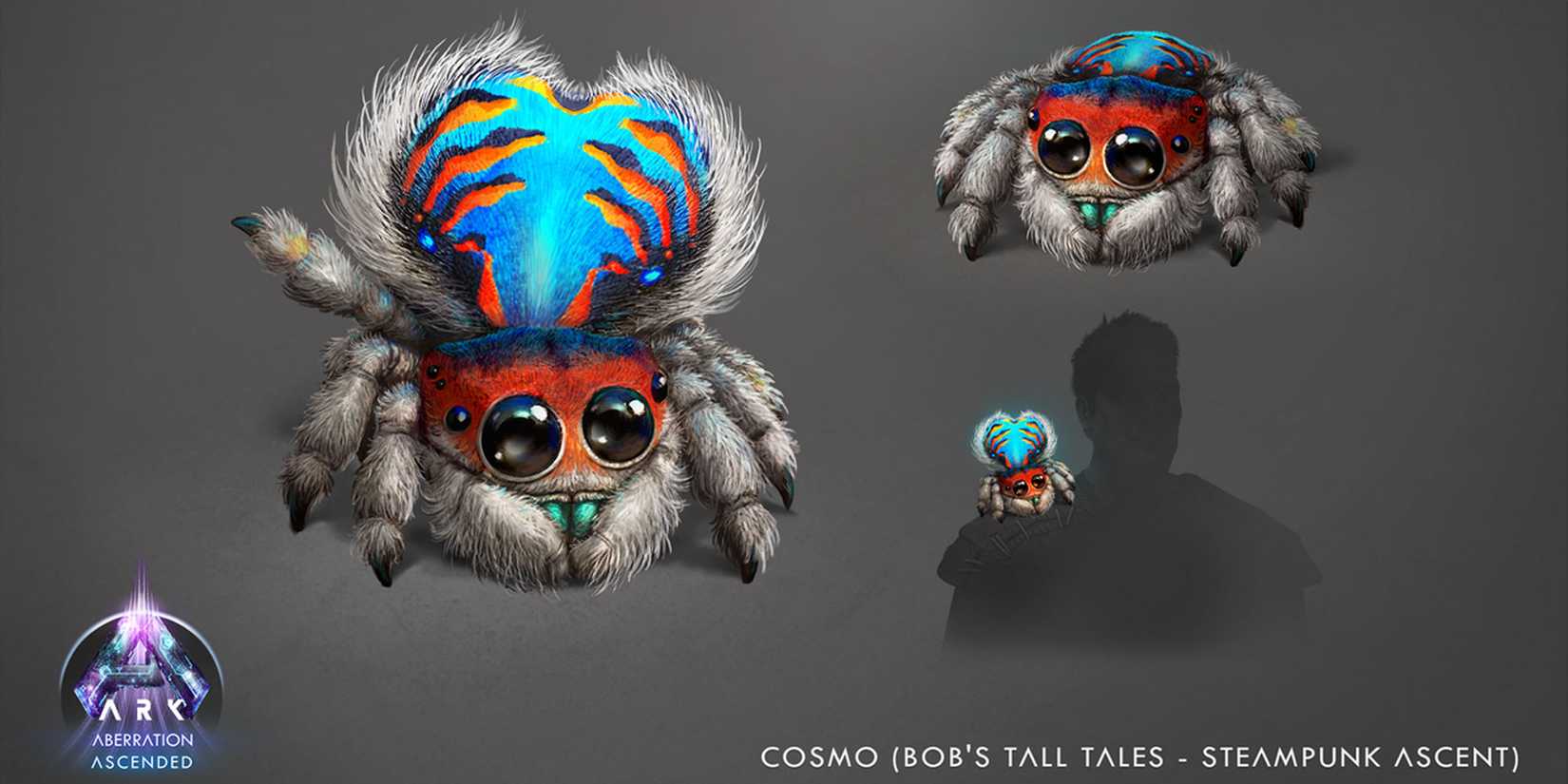
Ark: Survival Ascended Aberration's New Creature Could Add An Awesome ...