Red is a magnetic hue that can energize a room, a logo, or a wardrobe, yet pairing it correctly is essential for lasting style. Below are evidence‑based guidelines that help beginners combine red with complementary tones while avoiding common pitfalls, so the result feels fresh rather than fleeting.
Why Red Works as a Timeless Anchor
Historically, red has signaled power—from Renaissance art to modern corporate logos—because it draws the eye and evokes emotion. Its high visual weight makes it an effective anchor in any design, but that same strength can overwhelm if left unchecked. Understanding red’s position on the color wheel (opposite green, adjacent to orange and purple) provides the scientific basis for harmonious pairings.
Scenario: Red Accents in a Living Room
Imagine a neutral‑tinted living room with a deep‑red sofa. Pairing the sofa with warm gray walls, soft ivory upholstery, and a muted sage‑green rug creates a balanced backdrop. The green introduces the complementary contrast, while the neutrals mute red’s intensity, delivering a sophisticated, lived‑in feel.
Scenario: Red in Public Spaces
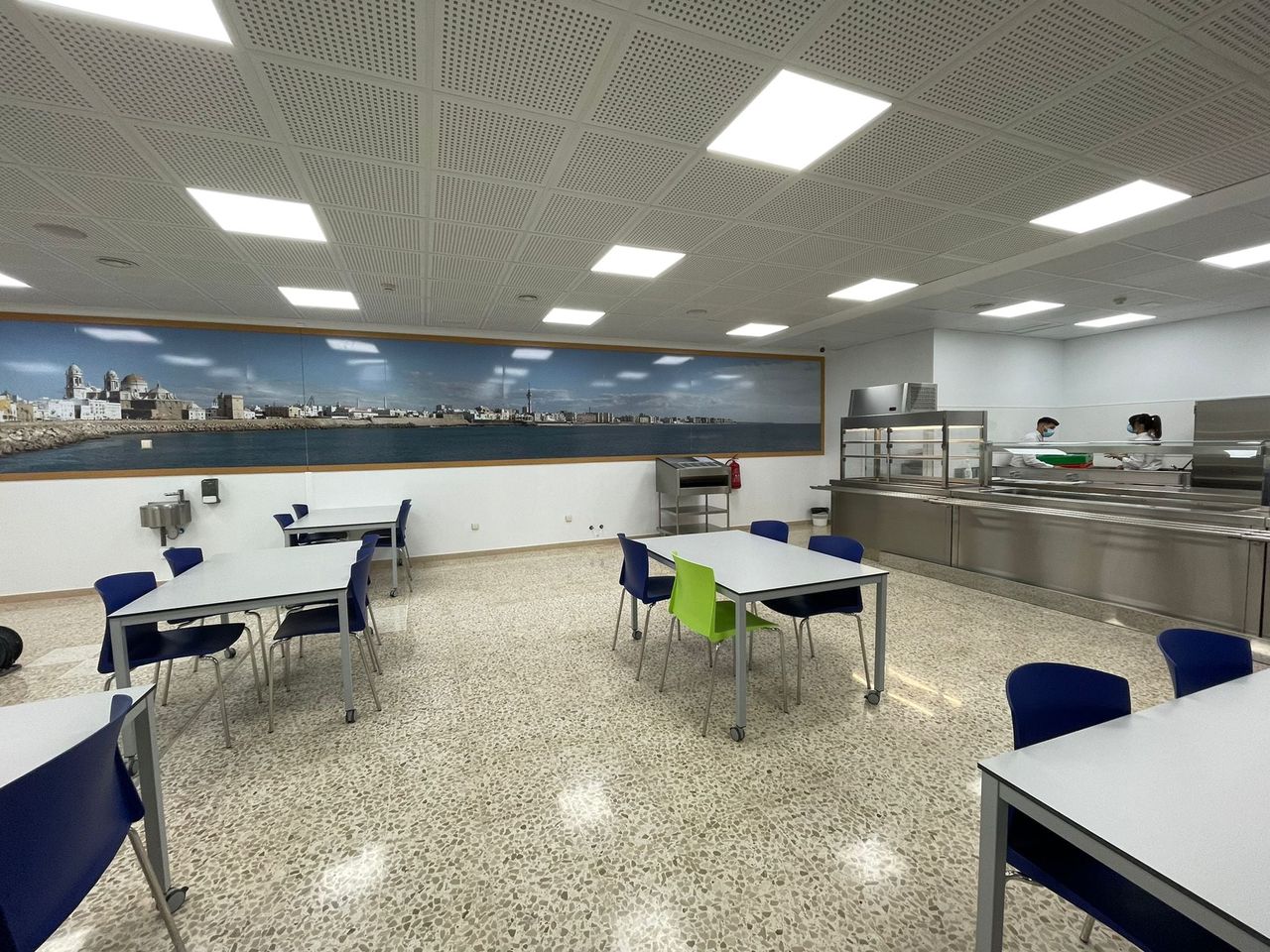
Architects often use red to highlight entryways or communal areas. The photograph below shows a striking red doorway at Hospital Puerta del Mar in Cádiz, illustrating how a single splash of red can define a space without clashing with surrounding blues and whites.
Practical Pairings: Safe Choices and Bold Moves
- Neutral allies – Charcoal, taupe, and cream let red speak without competition.
- Cool complements – Soft teal or dusty blue provide a calming counterpoint, ideal for offices.
- Warm opposites – Olive or muted mustard add depth while preserving warmth.
- Unexpected pops – A hint of lavender or muted gold can inject personality for fashion or branding projects.
When selecting a pairing, test the combination under the lighting conditions where it will appear; natural daylight softens red, whereas incandescent bulbs can make it appear harsher.
Caution: Overusing Red’s Dominance
Red’s ability to dominate means it can quickly become aggressive. Avoid covering more than 30 % of a surface area with pure red unless you intend a dramatic statement. In branding, an all‑red logo may appear aggressive in financial services but works well for food or entertainment where excitement is prized.
Putting It All Together: A Step‑by‑Step Palette Builder
- Identify the primary red hue (crimson, burgundy, or scarlet).
- Select a neutral base (gray, beige, or white) that will cover the majority of the space.
- Choose one complementary color from the opposite side of the wheel (green‑toned).
- Add a secondary accent—either a warm analog (orange) or a cool analog (purple)—to create visual interest.
- Apply the palette in a 60‑30‑10 ratio: 60 % neutral, 30 % red, 10 % accent.
Following this framework ensures that red remains a timeless focal point, whether you’re redecorating a living room, designing a brand identity, or planning a public space.