Digital artists are increasingly leaning on Random Color Pattern Generators to break creative blocks, but many beginners misuse the tool, ending up with chaotic palettes that hurt more than help. Understanding the typical slip‑ups and adopting smarter strategies can turn a random output into a deliberate asset, reshaping how hobbyists and professionals alike approach color composition.
Why Artists Turn to Random Color Pattern Generators
Imagine a freelance illustrator staring at a blank canvas, unsure which hue will set the mood for a sci‑fi cityscape. A quick click on a random generator produces a surprising combination—neon teal, burnt ochre, and muted lavender. The spontaneity offers a fresh starting point, especially when time constraints prevent lengthy research. For beginners, the appeal lies in the immediate visual stimulus that bypasses the overwhelm of choosing from an endless color wheel.
Common Pitfalls When Using Random Generators
Treating Random Output as Final Design
Many novice users accept the first palette they receive without scrutinizing harmony, contrast, or accessibility. The result can be an artwork where foreground elements vanish against a similarly toned background, or where essential details become indecipherable for color‑blind viewers.
Relying on a Single Tool
Most generators operate on fixed algorithms—often based on hue rotation or simple complementary rules. Overreliance on one platform limits exposure to diverse color theories and can stunt growth in color literacy.
Ignoring Contextual Needs
Random palettes don’t consider the narrative, lighting, or cultural symbolism behind a piece. A vibrant orange may be perfect for a sunrise scene but clash with a nighttime horror illustration.
Smarter Ways to Integrate Random Palettes Into Your Workflow
Instead of adopting the first list, use the generator as a brainstorming springboard. Start by generating three distinct palettes, then evaluate each against three criteria: contrast ratio, emotional tone, and genre suitability. Narrow down to the strongest candidate and refine it manually—adjust saturation, shift hue, or replace a single swatch with a more appropriate shade.
Pair the random tool with a reputable color theory resource, such as a digital color‑wheel app or a textbook on emotional color psychology. This hybrid approach teaches beginners why a generated combination works—or doesn’t—while still preserving the element of surprise.
Another practical tactic is to apply the random palette selectively. Use it for background elements, texture overlays, or accent details, while keeping primary subject colors under tighter control. This balances novelty with readability, ensuring the artwork remains cohesive.
What This Means for the Future of Digital Art
When artists treat Random Color Pattern Generators as a collaborative partner rather than a shortcut, the tool elevates both productivity and learning. Studios can speed up concept phases, while art students gain hands‑on experience dissecting color relationships. As AI‑driven generators become more context‑aware—factoring in mood, lighting, or audience—they’ll likely become standard fixtures in every illustrator’s toolkit, reshaping the creative process from guesswork to informed experimentation.
Tips For Travellers Packing List
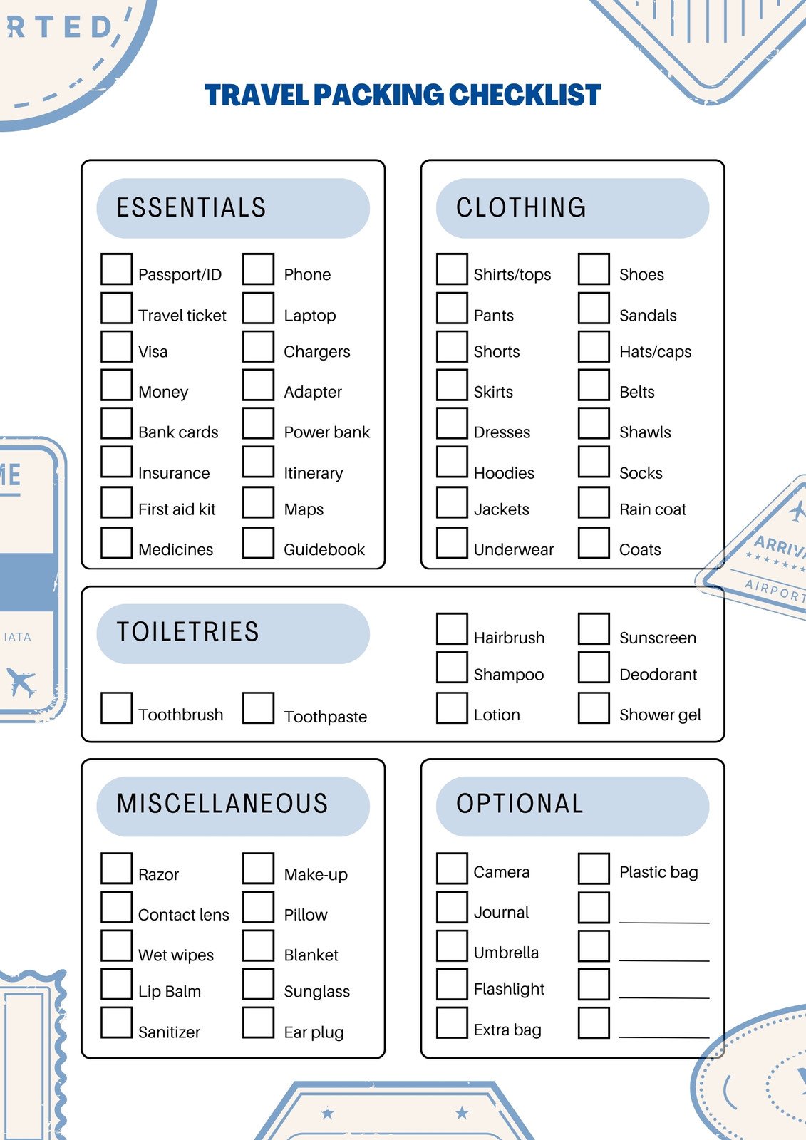
Tips For Travellers Packing List
Packing List For Your Trip Ultimate Checklist And Essential Packing

Packing list for your trip ultimate checklist and essential packing ...
3 Free Printable Packing List Downloads – Artofit

3 free printable packing list downloads – Artofit
Trip Essentials Packing List | Insiderpuj.com

Trip essentials packing list | Insiderpuj.com
Free Printable Packing Checklists | POPSUGAR Smart Living
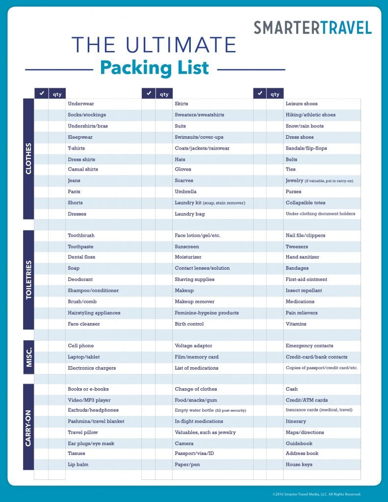
Free Printable Packing Checklists | POPSUGAR Smart Living