Businesses and policymakers alike are discovering that traditional line charts often mask the nuanced behavior of inflation; employing advanced graphing techniques can surface hidden patterns, reveal cyclical drivers, and guide more precise decisions.
Why Conventional Charts Miss the Mark
Most analysts rely on simple month‑to‑month line graphs, which convey trend direction but rarely expose underlying structures. This approach leads to three recurring mistakes:
- Over‑smoothing. Applying moving averages without preserving variance flattens spikes that could signal supply‑chain shocks.
- Ignoring seasonality. Failing to deseasonalize data mixes recurring patterns with genuine inflationary pressure.
- Single‑metric focus. Tracking only a headline index neglects component prices that may be diverging dramatically.
Smarter Alternatives that Reveal What’s Hidden
Heat‑Map Matrices
Mapping CPI sub‑indices on a color‑scaled matrix lets viewers spot clusters of rapid price changes, such as energy versus services, in a single glance. Compared with a line chart, heat‑maps instantly highlight which sectors are driving the overall rate.
Dynamic Scatterplots
Plotting inflation against related variables—like unemployment or commodity prices—while animating over time creates a moving picture of correlation shifts. Unlike static regression tables, dynamic scatterplots show when relationships strengthen or fade, informing timing for policy adjustments.
Radial (Spider) Charts
When assessing multi‑category inflation (housing, food, transport, etc.), radial charts display each category’s contribution as a spoke. Analysts can compare periods side‑by‑side to detect re‑balancing or emerging inflationary pressures that linear charts would obscure.
Practical Steps to Deploy Advanced Visuals
- Gather granular data. Use monthly breakdowns at the lowest available level (e.g., regional CPI or product‑level indices).
- Clean and normalize. Remove outliers, apply seasonal adjustments, and align timestamps across datasets.
- Select appropriate software. Tools like Tableau, Power BI, or Python’s Plotly library enable interactive heat‑maps and animated plots without extensive coding.
- Iterate with stakeholders. Present early drafts, gather feedback on readability, and refine color palettes to ensure accessibility for color‑blind viewers.
- Document assumptions. Clearly note any smoothing parameters or index base years so that downstream users can reproduce the visual.
Scaling Insight: From Dashboard to Decision Engine
Once an organization adopts these techniques, the next challenge is integrating them into routine analysis. Embedding live visuals into a central dashboard allows real‑time monitoring, while linking the dashboard to alert systems can trigger automated notifications when a sector’s inflation rate exceeds predefined thresholds. This shift from static reporting to proactive insight reduces reaction lag and aligns operational budgets with emerging cost trends.
Bottom Line for Value‑Focused Buyers
Investing in advanced graphing capabilities delivers a tangible ROI: clearer risk identification, faster policy response, and more accurate forecasting. By sidestepping common visualization pitfalls and leveraging heat‑maps, dynamic scatterplots, and radial charts, decision‑makers can truly unlock hidden patterns in inflation data with advanced graphing techniques—turning raw numbers into actionable, value‑creating intelligence.
Carte Albanie | Carte
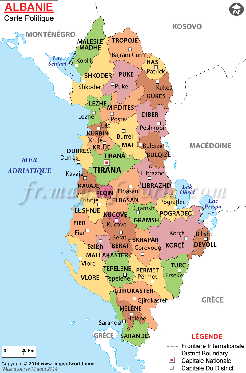
Carte Albanie | Carte
Voyage En Albanie : Notre Itinéraire Et Nos Conseils - Blog Voyage
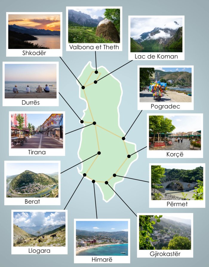
Voyage en Albanie : notre itinéraire et nos conseils - Blog voyage
Albania Tourism: Carte Touristique De L'Albanie

Albania Tourism: Carte touristique de l'Albanie
Albanie Carte | Carte
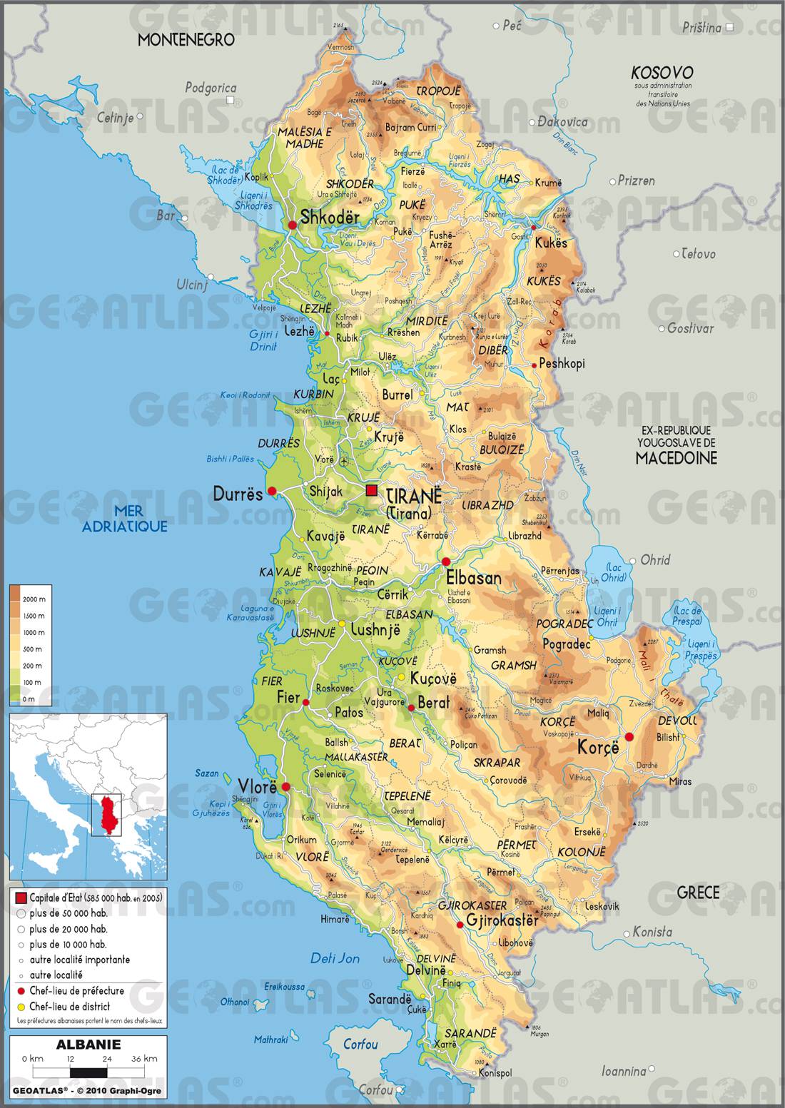
Albanie Carte | Carte
Albanie Carte | Lonely Planet

Albanie carte | Lonely Planet