In contemporary visual communication, green and red function as the most immediate opposites on the color wheel, a relationship that drives perception, emotional response, and brand differentiation. By understanding the psychological and cultural nuances behind this contrast, marketers, designers, and product managers can make data‑informed choices that amplify visibility and convey intended messages without relying on gimmickry.
What makes green the visual counterpoint to red?
Color theory defines complementary pairs as hues situated directly across from each other on the hue circle; green (approximately 120°) and red (approximately 0°) meet this criterion. The complementary nature creates a high‑contrast visual punch that the human eye naturally registers. Psychologically, red is associated with urgency, passion, and warning, while green signals growth, safety, and calm. This duality is reinforced by cultural cues—traffic signals, for instance, use red for stop and green for go, embedding the contrast into everyday cognition.
How have businesses capitalized on the green‑red dynamic?
Brands in competitive sectors routinely employ the green‑red opposition to clarify choice or highlight hierarchy. In retail, grocery chains often place fresh produce displays against red signage to draw shoppers’ attention to healthier options. Technology firms leverage green UI elements to denote successful actions (e.g., a green checkmark) while reserving red for error alerts, reinforcing user confidence through immediate visual feedback. Moreover, environmental campaigns purposefully pair green imagery with red warnings to emphasize sustainability stakes, turning the contrast into a narrative device rather than a mere aesthetic choice.
Which strategic decisions should trend‑aware readers consider?
When evaluating whether to integrate green as red’s visual opposite in a project, assess three practical dimensions:
- Audience perception. Conduct quick A/B tests with target segments to gauge whether green evokes the intended calm or trust signal, especially if your brand already leans heavily on red tones.
- Medium constraints. Digital platforms render colors differently across devices; ensure that the selected shades maintain sufficient contrast ratios to meet accessibility standards (WCAG AA minimum 3:1 for large text).
- Brand hierarchy. Use green sparingly to accentuate key actions or to differentiate sub‑categories, avoiding a full‑scale palette swap that could dilute brand recognition.
By aligning these considerations with the innate oppositional relationship of green and red, decision‑makers can harness the built‑in visual tension to guide attention, reinforce messaging, and uphold usability.
What are the immediate next steps?
Start by auditing existing color assets: identify where red dominates and where a complementary green could introduce hierarchy without overwhelming the visual field. Prototype two variations—one retaining red as the primary hue, the other introducing a calibrated green accent—and run a short usability test (five‑minute task on a representative sample). Analyze click‑through rates, error frequency, and subjective satisfaction scores. If the green‑accented version shows measurable gains in clarity or conversion, integrate the palette incrementally, monitoring brand consistency throughout the rollout.
How To Make The Most Out Of Linkedin In 10 Easy Steps – Artofit

How to make the most out of linkedin in 10 easy steps – Artofit
19 Top LinkedIn Profile Tips For Job Seekers
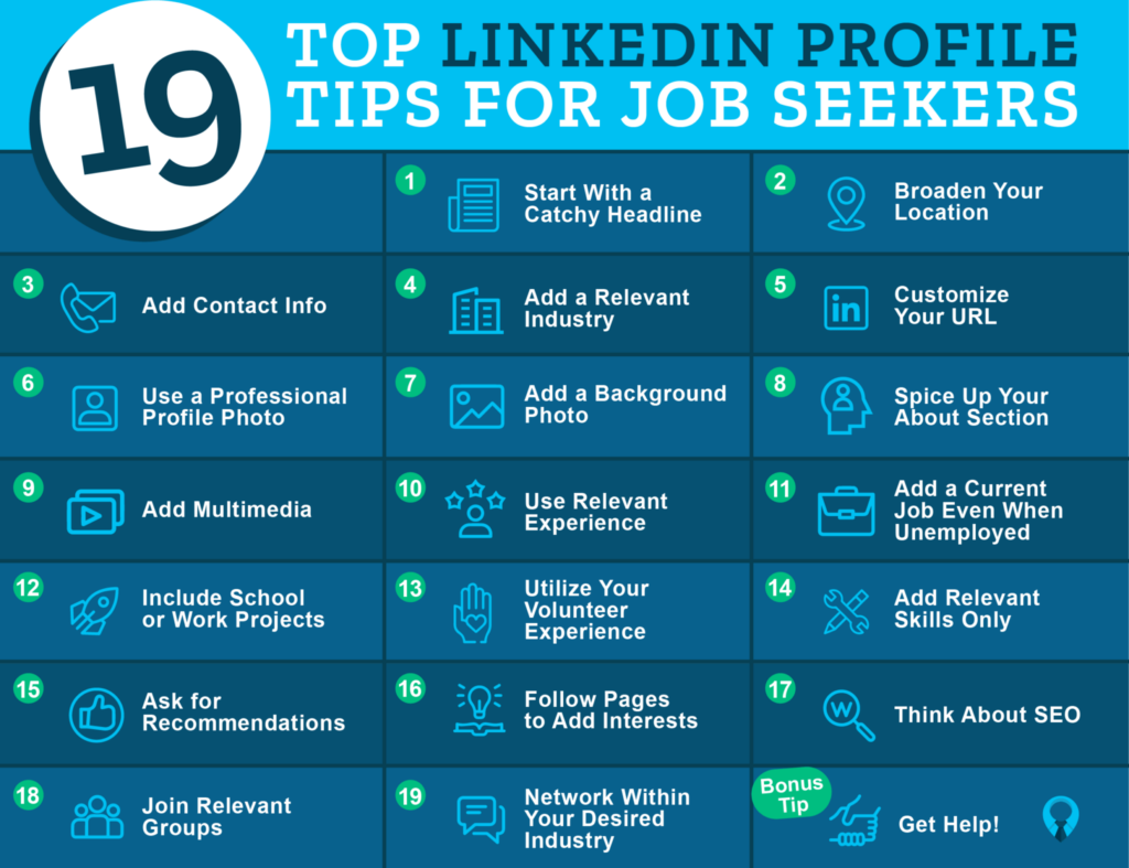
19 Top LinkedIn Profile Tips for Job Seekers
How To Make A Good Linkedin Profile Picture - Design Talk
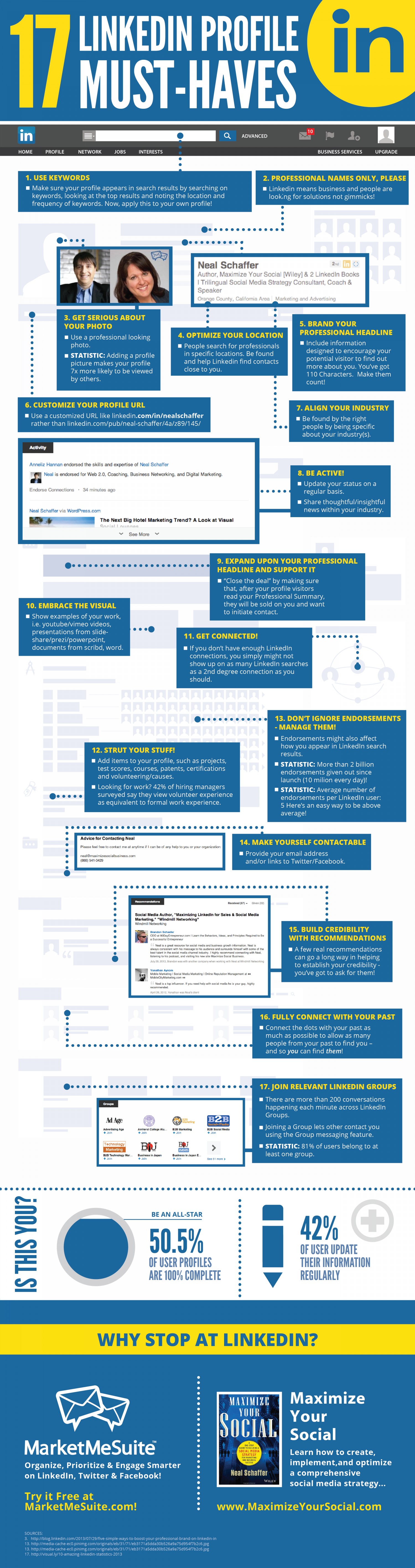
How To Make A Good Linkedin Profile Picture - Design Talk
Five Simple Ways To Boost Your Professional Brand On LinkedIn

Five Simple Ways to Boost Your Professional Brand On LinkedIn ...
LinkedIn Tips: How To Craft The Perfect Profile (infographic)
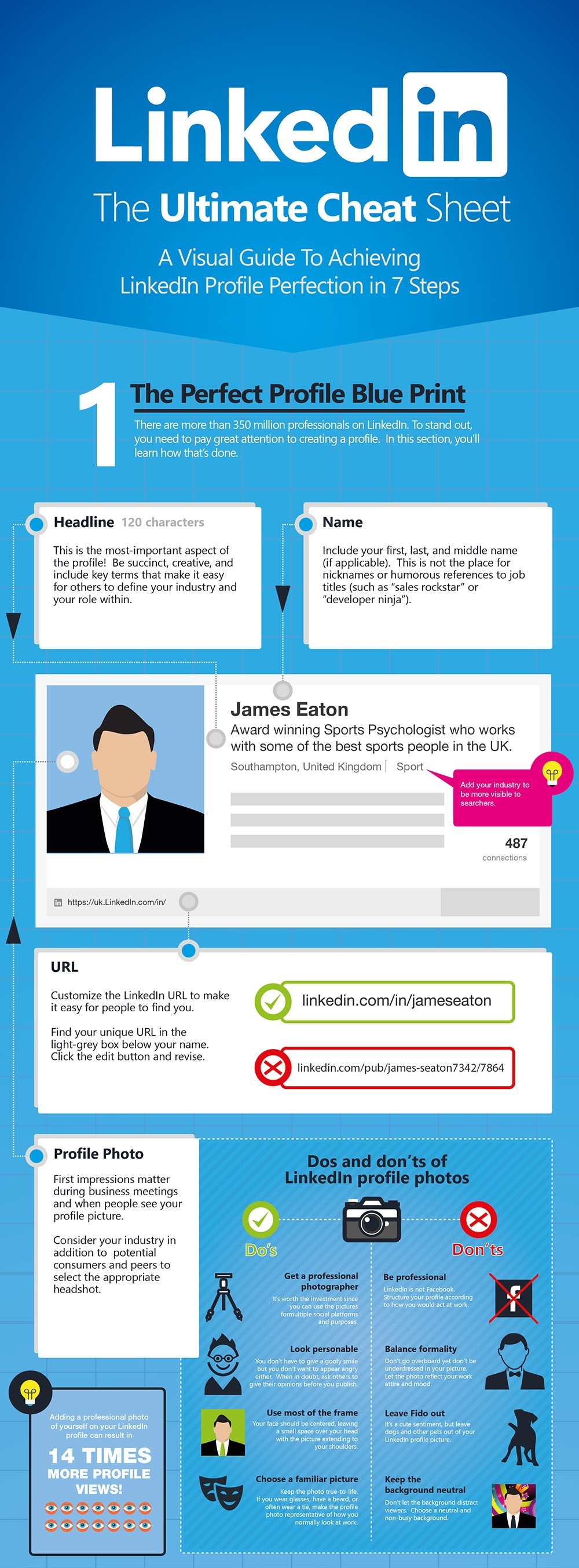
LinkedIn tips: How to craft the perfect profile (infographic)