Design professionals have converged on a single, surprisingly easy method for pinpointing the exact opposite of red on the color spectrum—a technique that cuts through trial‑and‑error and delivers reliable results for branding, interior décor, and digital artwork. The trick, rooted in a straightforward manipulation of hue values, promises both speed and accuracy, giving seasoned hobbyists a dependable shortcut without sacrificing nuance.
Why Knowing Red’s Complement Matters
Red’s opposite, traditionally known as cyan or blue‑green, is a staple in complementary color schemes. When paired correctly, the two hues amplify each other’s vibrancy, creating visual tension that draws the eye without overwhelming the viewer. For hobbyists who dabble in everything from canvas painting to UI mock‑ups, mastering this relationship can elevate a project from “good” to “memorable.”
Step‑by‑Step: The Hue‑Shift Shortcut
The core of the trick lies in shifting the hue angle of pure red (0° on a 0‑360° wheel) by 180°. Instead of consulting a printed chart, designers use any basic color picker that displays hue values. Here’s the process:
- Open a digital color picker (most graphics programs include one).
- Enter the hue for your red—typically 0° or 360°.
- Add 180° to the hue value; if the sum exceeds 360°, subtract 360° to wrap around the wheel.
- The resulting hue is the exact opposite; for pure red, 0° + 180° = 180°, which corresponds to cyan.
- Adjust saturation and brightness as needed to match the context (e.g., a darker cyan for a night‑mode UI).
Because the calculation is arithmetic, it works consistently across software, from Photoshop to free‑hand sketch apps, and eliminates the guesswork of visual matching.
Immediate Benefits for the Hobbyist
Speed. A single numeric edit replaces minutes of swatching, freeing up time for other creative decisions. Precision. Numeric hue values guarantee that the complement aligns perfectly with the intended red, whether it’s a scarlet logo or a crimson sunset. Portability. The same method translates to physical media—mixing pigments to the calculated hue yields a reliable complement on canvas or fabric.
Potential Pitfalls and How to Avoid Them
While the hue‑shift technique is robust, a few cautions are worth noting. First, pure red (0°) rarely appears alone in real‑world projects; most reds carry a tint or shade that shifts the hue slightly, meaning the opposite may drift toward teal rather than pure cyan. Second, color perception varies across devices; a hue that looks balanced on a calibrated monitor might appear off on a printed brochure due to CMYK conversion. Finally, cultural connotations—such as red representing luck in some regions and danger in others—can affect how the complementary pairing is received, so designers should consider audience context before finalizing the palette.
Real‑World Application: From Sketch to Screen
Consider a hobbyist designing a sports team mascot that features a vivid red. Using the trick, they calculate the opposite hue (180°) and select a cyan shade for the background banner. After testing the duo on a prototype jersey, they notice the red mascot pops while the cyan backdrop remains visually comfortable. The designer then tweaks the cyan’s brightness by 10% to improve legibility on a mobile app, demonstrating how the simple arithmetic method can be fine‑tuned for various media.
What This Means for the Design Community
By codifying the opposite‑color discovery into a three‑step numeric operation, designers are equipped with a repeatable, low‑tech tool that respects both creative intuition and technical rigor. Hobbyists, who often balance passion with limited resources, stand to gain the most: they can now achieve professional‑grade color harmony without expensive software plugins or endless experimentation. As the technique spreads through tutorials and design forums, it’s likely to become a standard checkpoint in the color‑selection workflow, reinforcing the principle that even complex visual problems can have elegant, arithmetic solutions.
Scrub Basin Sink Double Tap 6′ Ft Fix Scrub – Stainless Steel
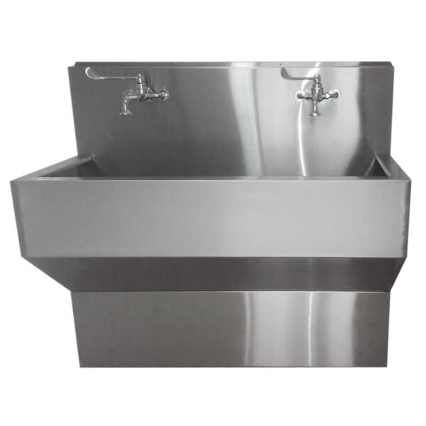
Scrub Basin Sink Double Tap 6′ ft Fix Scrub – Stainless Steel ...
Surgeon Scrub Up Sinks | Wall Mounted And Floor Mounted Scrub Sinks

Surgeon scrub up sinks | Wall mounted and floor mounted scrub sinks
Scrub Sinks And Cleaning Stations – ATCO TECH

Scrub Sinks And Cleaning Stations – ATCO TECH
Hospital Acrylic Solid Surface Sink Surgial Hand Washing Basin Scrub

Hospital Acrylic Solid Surface Sink Surgial Hand Washing Basin Scrub ...
Medical Scrub Sink - Sunrise Purification

Medical Scrub Sink - Sunrise Purification